Selfridges
Mega Nav
Optimising navigation to boost discovery and engagement
What’s the problem?
Selfridges was launching a new luxury Service which needed to be prominently positioned to drive customer acquisition.
The existing navigation was cluttered and inconsistent, making Service offerings difficult to find.
The business needed updated, data-driven recommendations to determine the best placement for the new Service and identify other UX improvements to enhance navigation efficiency and performance.
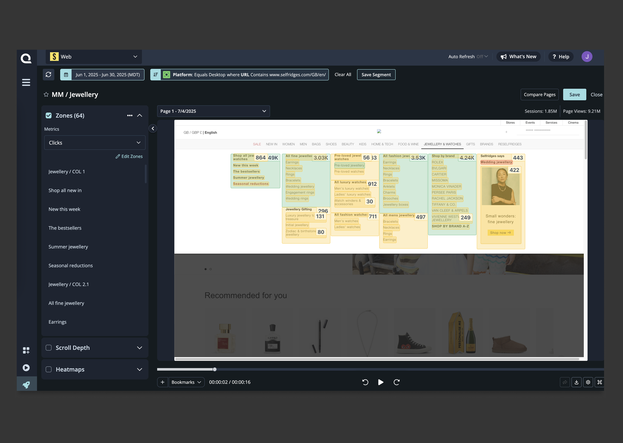
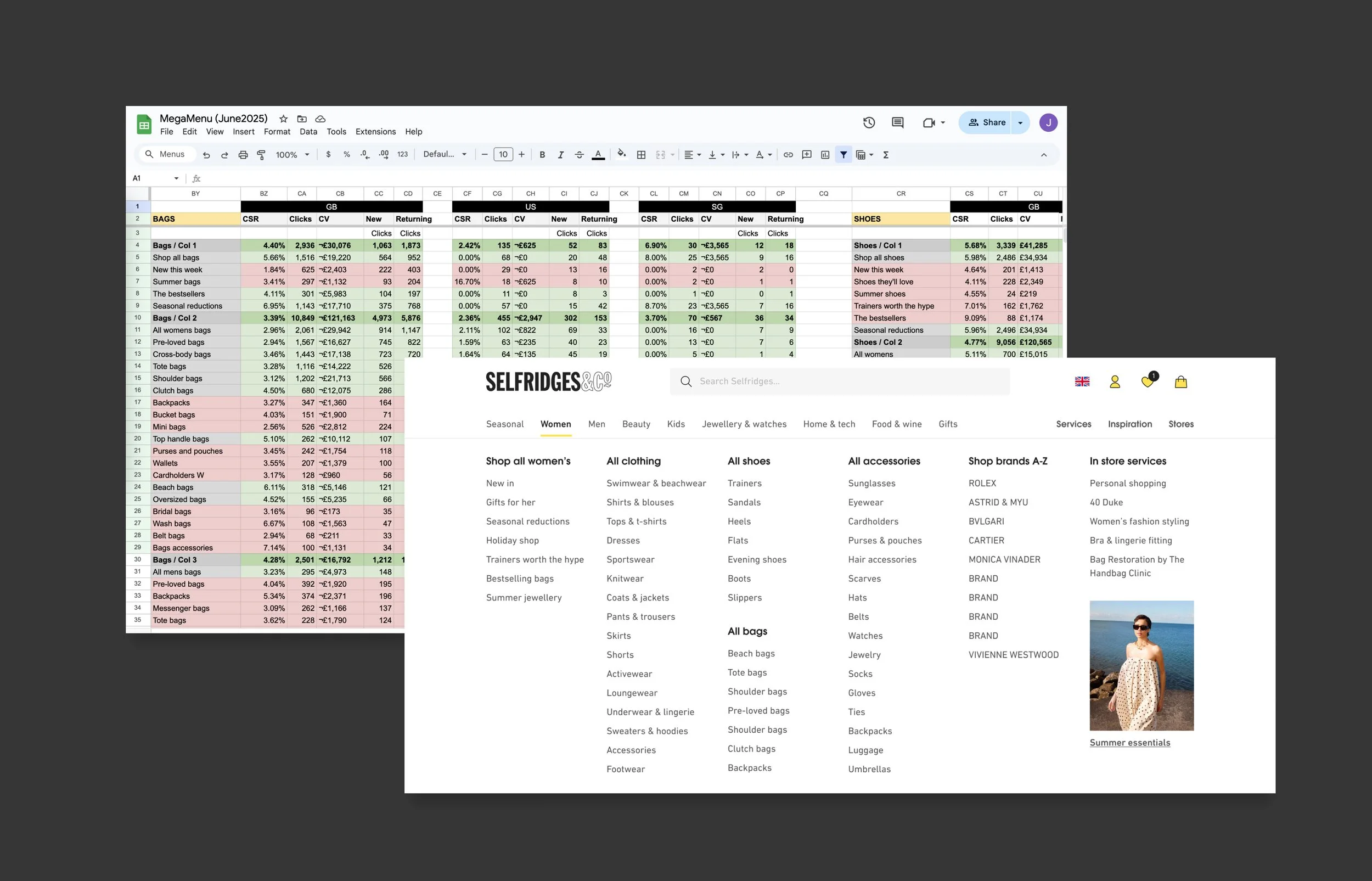
Using Quantum Metrics to source data
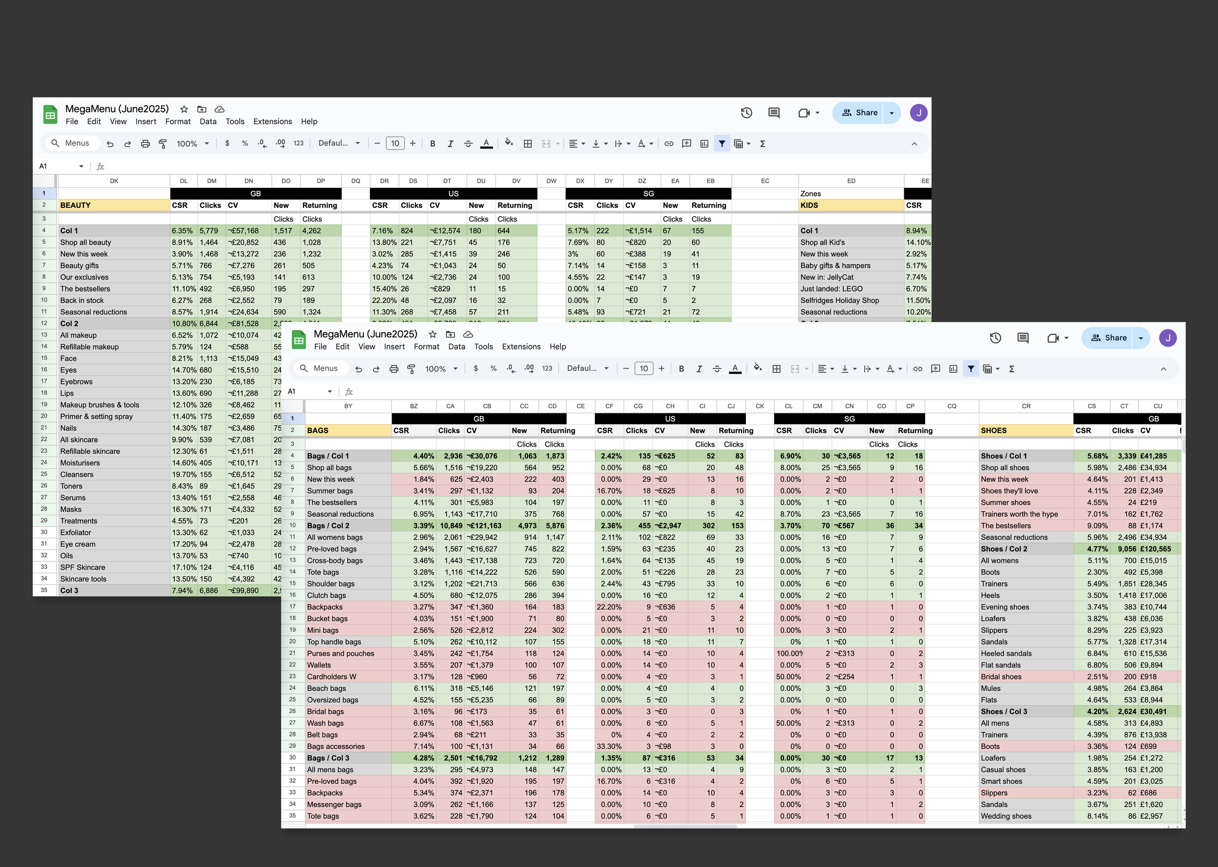
Organising data into structured excel doc
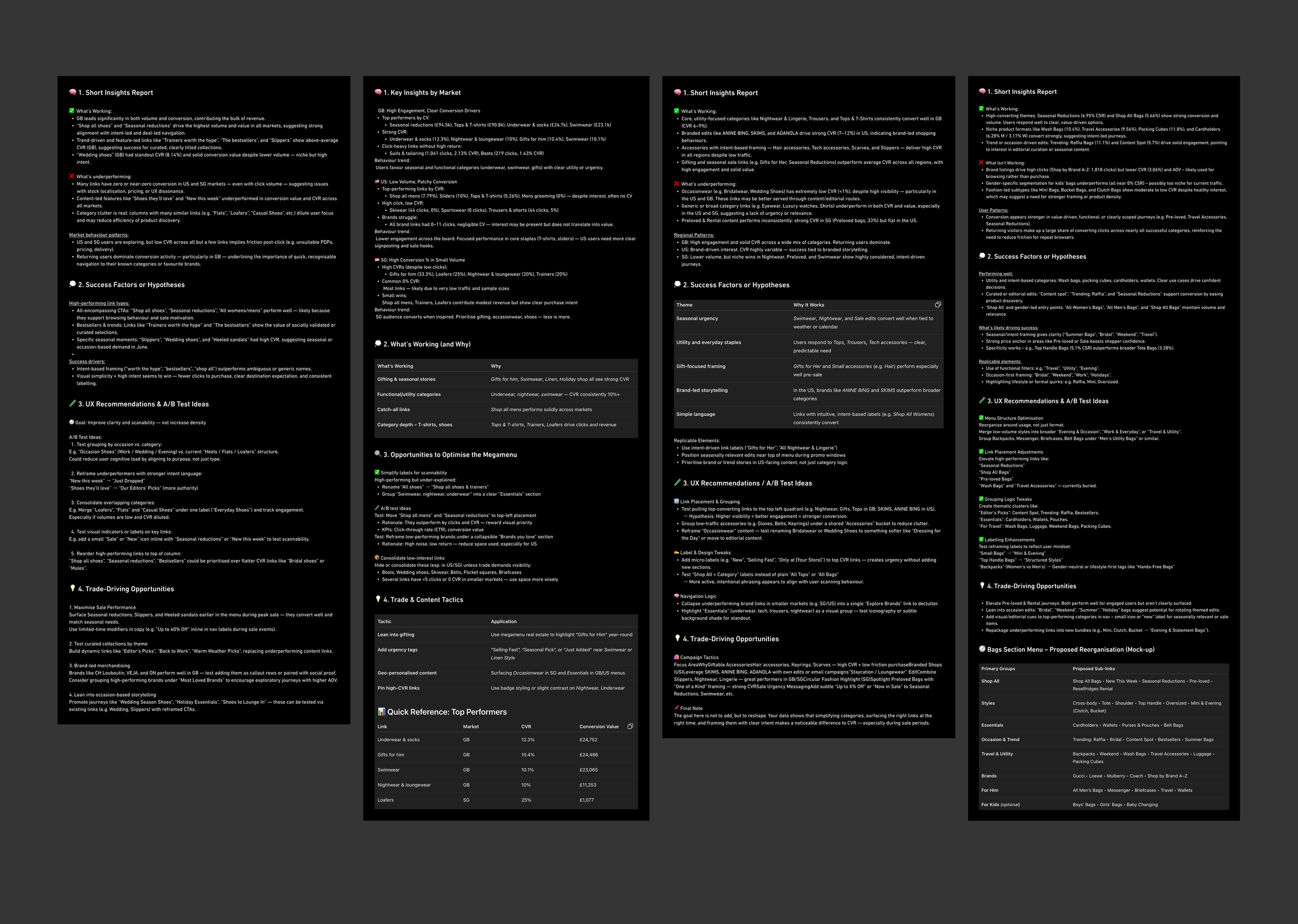
Summarising findings in ChatGPT
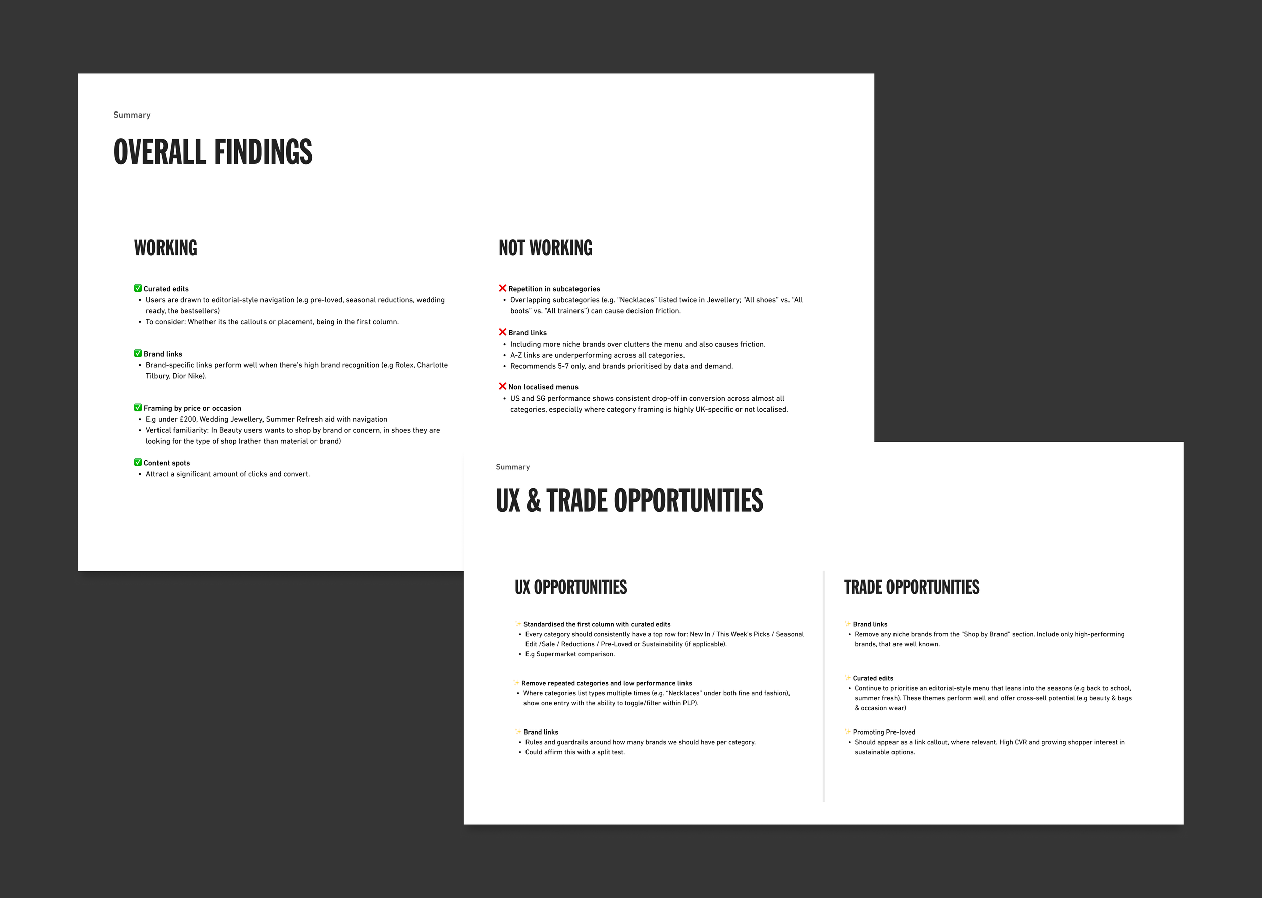
Simplifying results for stakeholder playback
My role & process
Audited current navigation - identified UX pain points, dead ends and missed opportunities
Analysed user data - analysed heatmaps, click-through and conversion rates to inform design decisions
Applied AI to insights - summarising patterns, underperforming areas, UX improvements and A/B test ideas
Designed variations - created and presented proposed designs to stakeholders, recommending A/B tests to measure impact
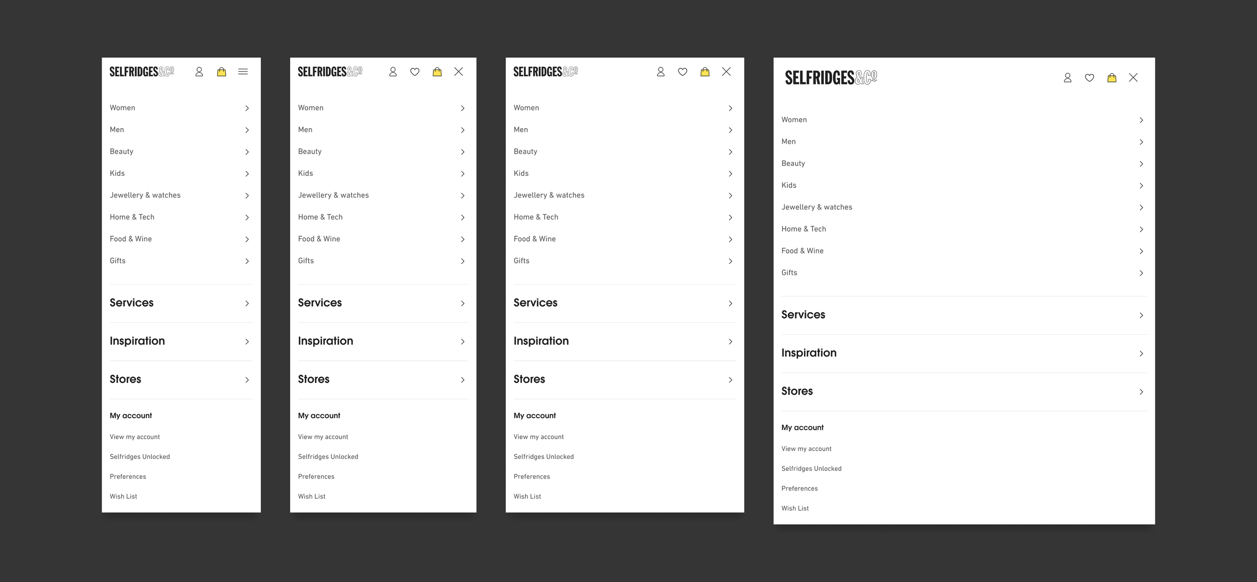
Menu breakpoints & scalability
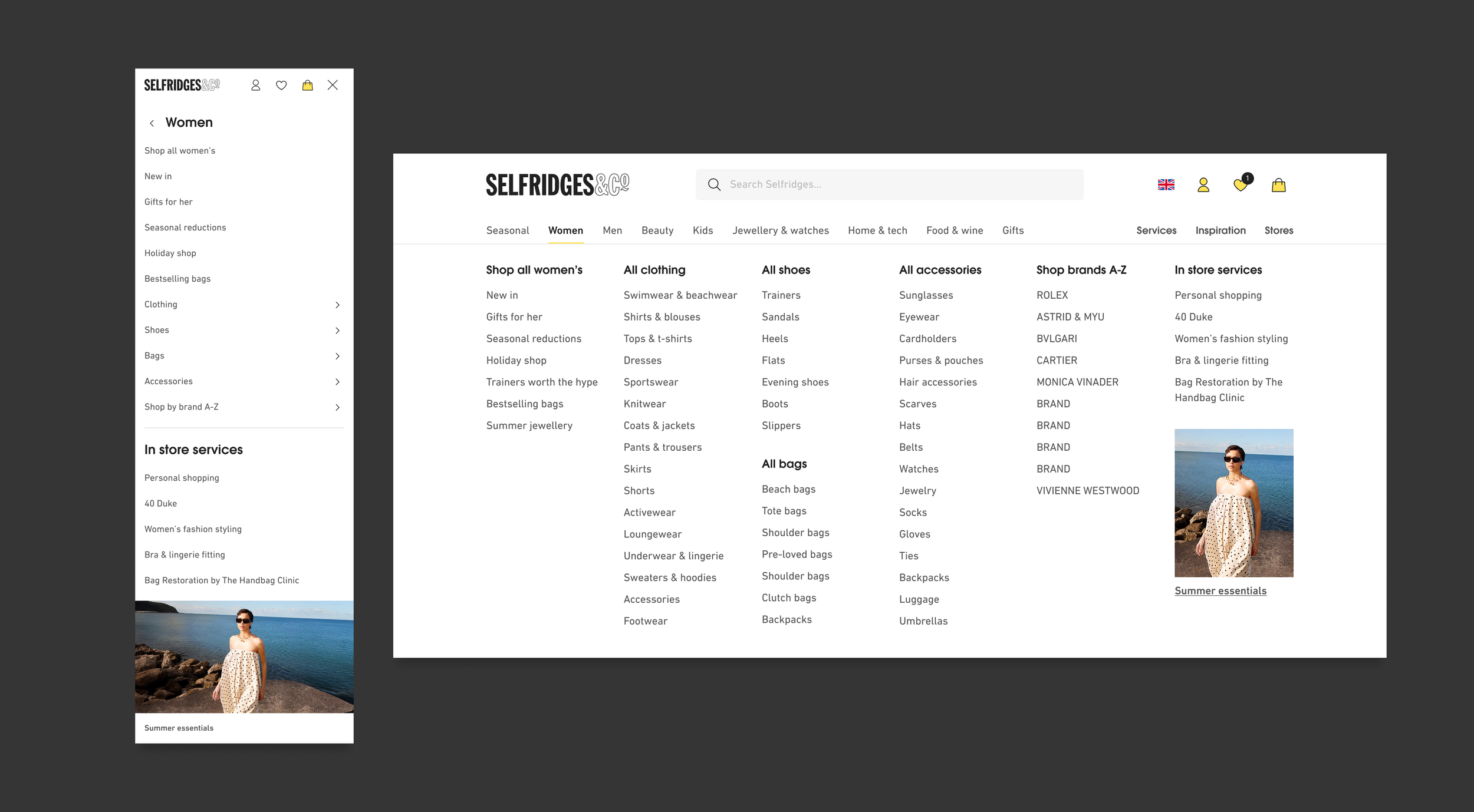
Shopping category - Womens
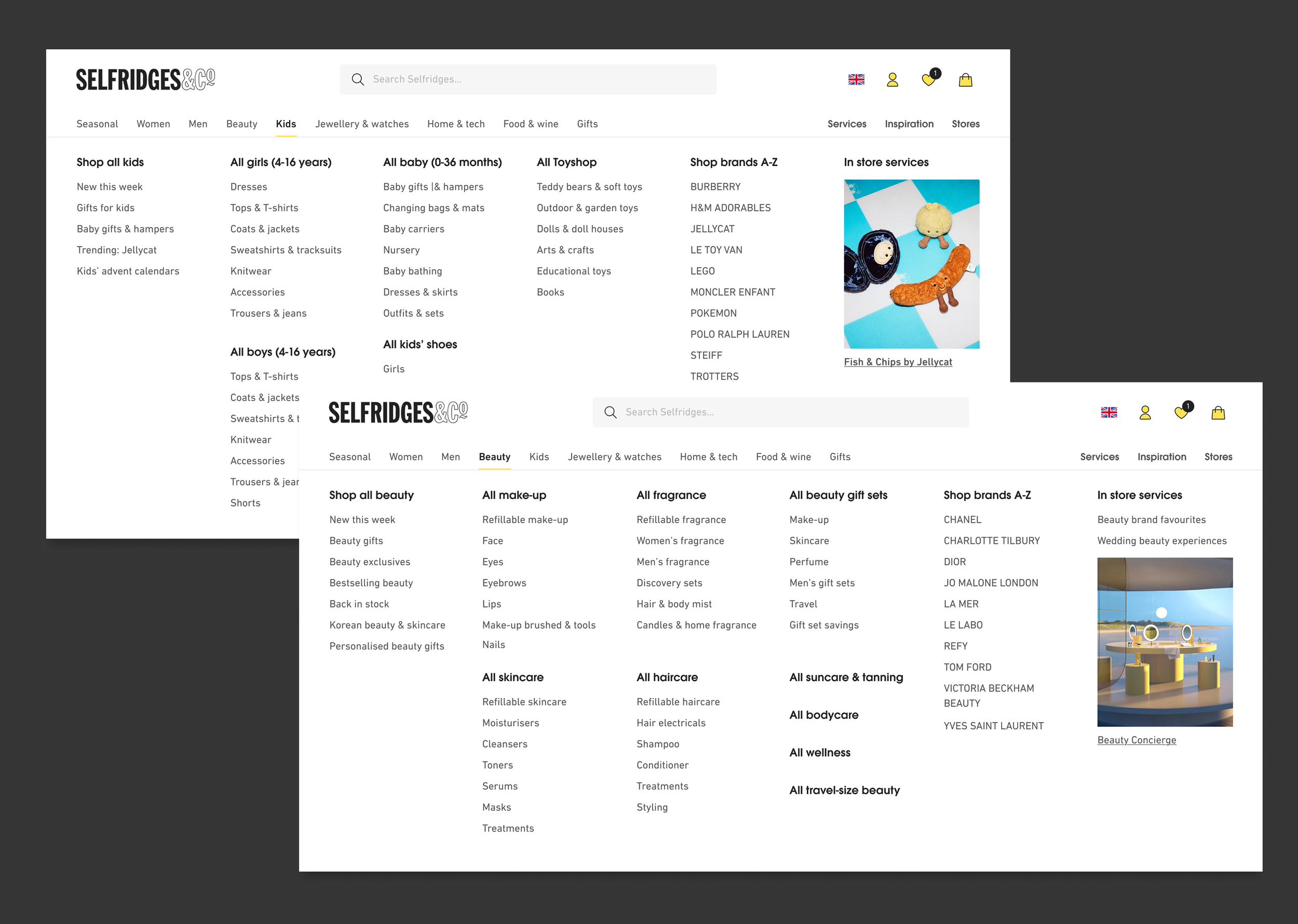
Shopping category - Kids & Beauty
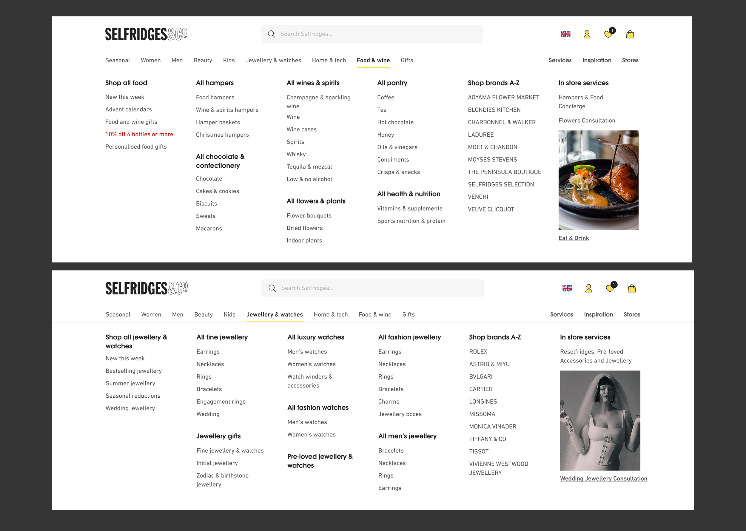
Shopping category - Food & Jewellery
Challenges
Balancing business priorities with user clarity (e.g new services and breadth of product vs streamlined experience)
Engineering effort required for new structure under time constraints and low developer resource
Large data collection slowed down project progress, challenging timelines for A/B testing
Advocating for Mega Nav prioritisation against a list of A/B tests already in pipeline
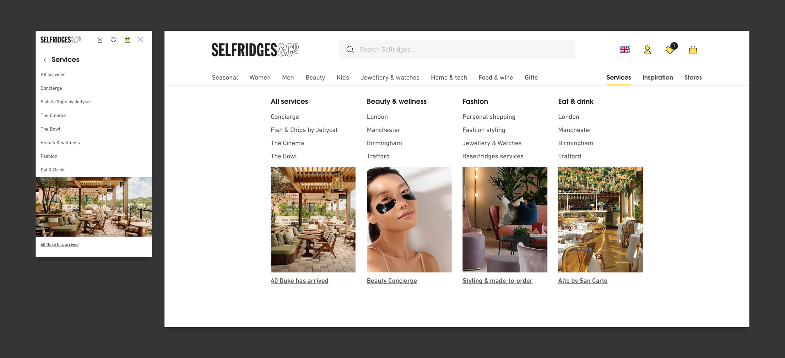
Services menu
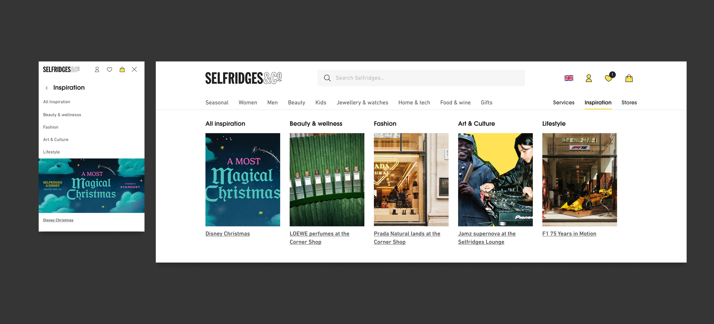
Inspiration menu
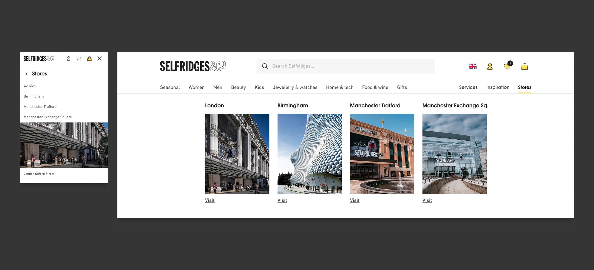
Stores menu
Deliverables
This project tested user advocacy, design principles and stakeholder pushback.
The following outcomes were delivered with the first A/B test now in setup.
Designed a scalable, intuitive navigation aligning both user needs and business priorities
Increased visibility of Selfridges Services, with the new luxury Service prominently positioned
Comprehensive data collection of Mega Nav to support future design iterations and A/B tests
Strengthened alignment between Design, Product and Engineering around navigation standards